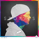
Vibrations In The Soul (Music Project)
- Nathan Jackson
- Sep 24, 2019
- 25 min read
Updated: Nov 11, 2019
Today i started looking at some music artists i could use in this project and as you can see below i have listed them with the songs i would be designing the art for.
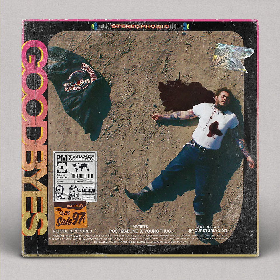
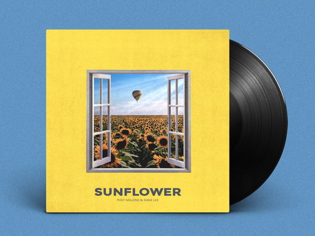
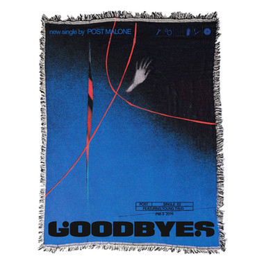
Post Malone - Goodbyes
XXXTentacion - Sauce!
Avicii - SOS
Juice WRLD - All Girls Are The Same
The first artist i want to look at is Post Malone and below i will go over each artist adding what i like about their work and their cover art and i will also be adding the reasons why i don't like the work and some of the ideas i would like to use to change the work.
POST MALONE
So Post Malone come out recently with an album called "Hollywood's Bleeding" and this included a number of songs and below you can see them listed below with all of the songs in the album.
You can click any of the songs and it will take you to the song on youtube.
Here you can see some of the cover art from Post Malone and below it will give me some inspiration that i wanted to do for the poster and album cover.


So For my poster i have decided to go for the song "Goodbyes" and i changed the song from Circles because i didn't know what to do with that cover so i had some thoughts and decided to change the song completely and this is where i decided to go to the song "Goodbyes" since i have a couple of ideas of what i want to do with this work.
What i don't like
I don't like the use of some text in the designs
I don't like the use of some of the textures that was used
What i like
I like the use of the colours that are shown in the designs
The use of photography spaced in an album cover
Simple designs that are effective
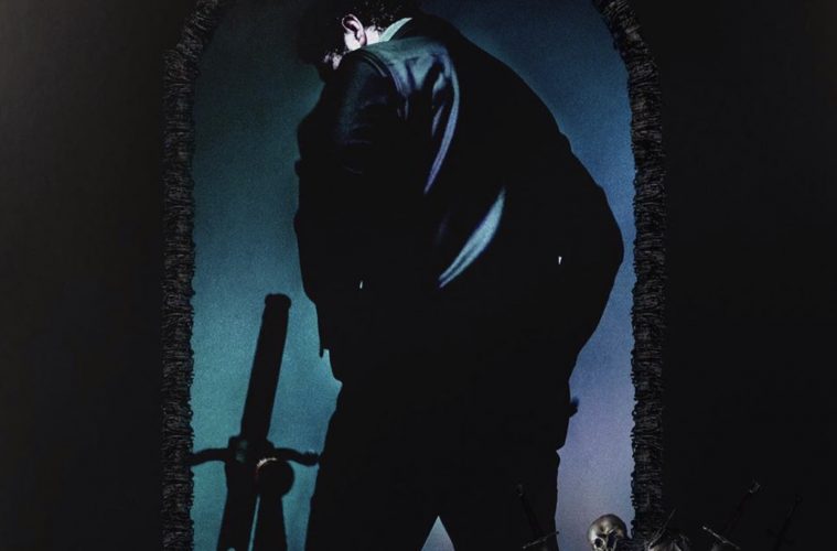
Below you can see the idea that i had when i drew up the goodbyes album cover

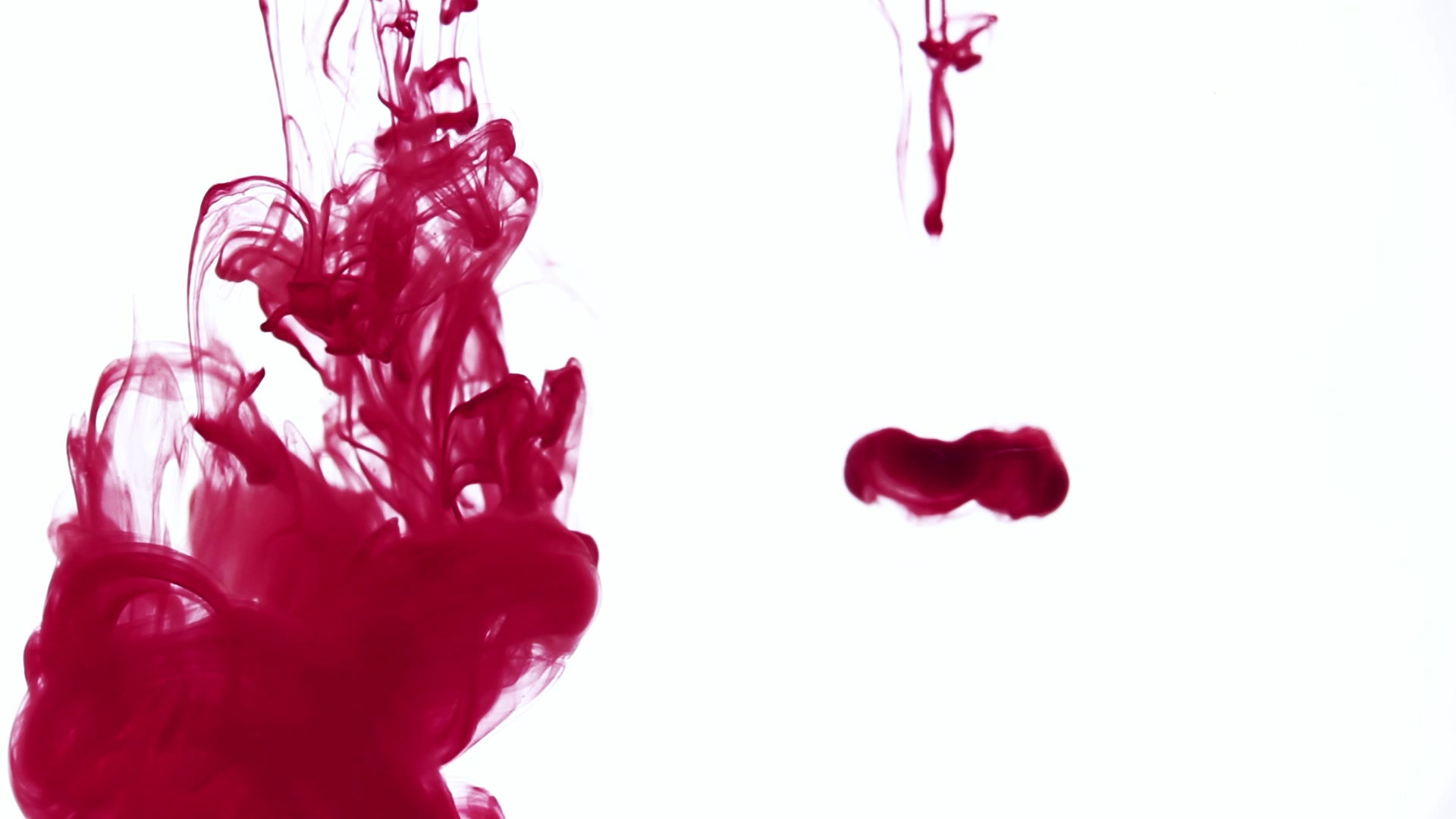
So in the poster ideas that i had i would add a doorway with blood in the background for the album name "hollywood's bleeding" so its like he's going into hollywood while it's bleeding this idea also came from a cover photo as yo can see below.

From the cover art i decided to add the silhouette and a silhouette of two swords getting held by the silhouette i also decided to go for the door look that was on the cover so it would be a curved door with the silhouette inside the album cover holding do swords.
Below you can see the idea of my text that i wanted to recreate for the poster/ album art.
I decided to use the text in the album cover and below you can see my version of the design.

This is my work and as you can see i took ideas from each poster/ album cover this not only shows i've taken inspiration from them this also shows i can match different types of designs together.
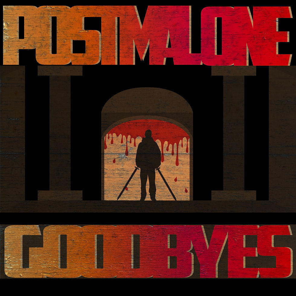
Now you can see the effect that has been applied to the cover of the album art the texture that i added was a wood texture and thats easily visible from the door with the blood.

This is the texture that was added to the art.
Experimentation
Here you can see that i experimented with deferent text layouts and i thought that the way i have the design now was good for what i wanted to do because there would be some stuff i like to change in the final image


Now you can see the background has been changed to have no blood for the album cover and the text has also been experimented with. The only design i like out of all of the album covers is the cover with the red text
below you can see the image in more detail

(This image is a screenshot of my work)
Text Experimentation

You can see with this image that i changed the way the text was shown on the design however i planned for the text to be at the top of the design and not at the sides and it shows that the design looks strange when the text has been flipped to go on the side.
I also left the background to be blank at the time of experimenting with the design this made the design look strange as it had no reference to the album that it was from (Hollywood's Bleeding).
Texture Experimentation
Here is all of my textures that i used, i used 9 in total

Here you can see all of the textures that i used. I got them off the website "Graphic Burger" i downloaded a wood texture pack and a marble texture pack to change the idea of my designs.
I tried 6 wood textures and 3 marble designs and this made the designs look good and bad because some of the textures fit the design and some of them don't but as you can see below you can see all of the designs with different textures on the final piece.


As you cans see the bottom right texture on the design looks like its meant to be there however i think the original design that i did looks a lot better because its the first texture i added and i got a lot of positive feedback from the design.

With the effects i decided to add a transparency option to the design and change it to multiply with a 10% opacity decrease and this makes the designs look how you can see them above because if i didn't have those transparency options added it would be an image blocking it.
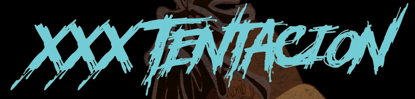
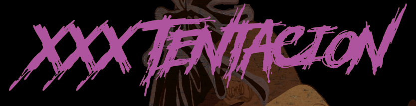
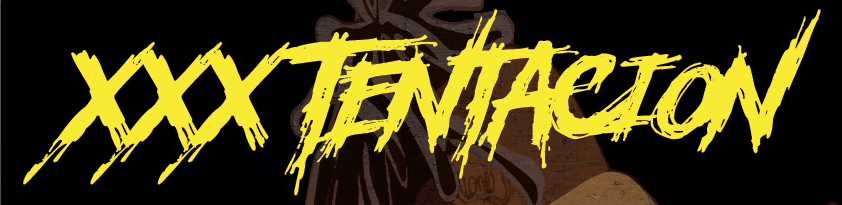
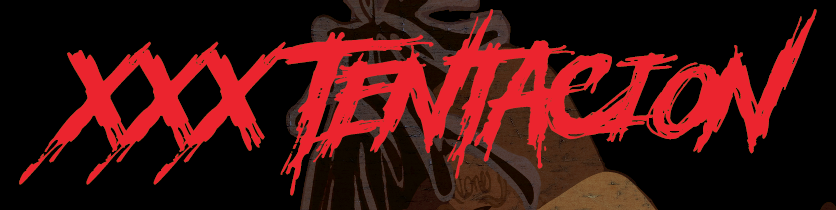
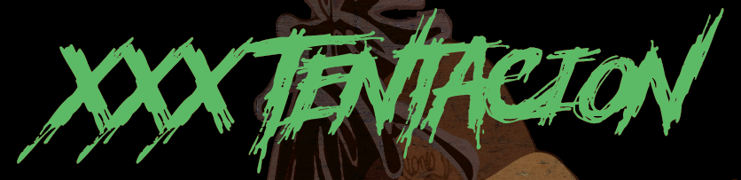
XXXTentacion
For this artist i decided to have a look at his newest music videos ofter he had died and the music videos where animated so i thought i would look at that for inspiration on what to do with this album cover so below you can see the research i did.


Here you can see there are some screenshots from the music videos (they are linked below this) i also have a photos of the late rapper and i was going to use it for an album cover but i wasn't too sure on it, XXXTentacion was a controversial rapper before he died and the music videos you can see below are the ones i had a look at and got these screenshots.
Music videos that i used
Now i only used 2 music videos for this artist however, i decided i wanted to do 3 album covers so i included the song "Moonlight" and that music video was taken before he died and below you can see the finished work and below that you can see my experimentation with the work too.

Here you can see how i planned my work for what i wanted to do and its a simple sketch but i felt that it was an effective part that led to the final product


(Below you can see them in more detail)
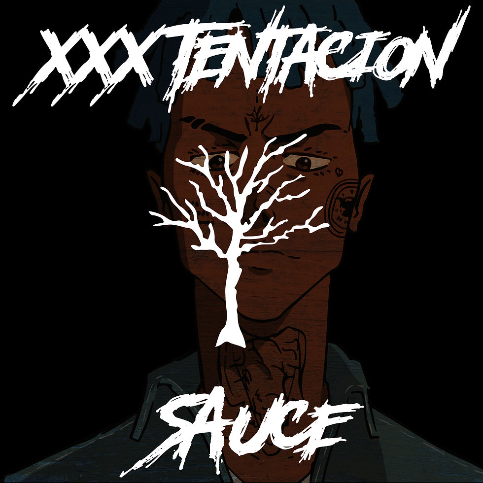


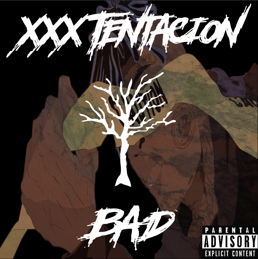
So here is the final designs that i created with the help of the image research and as you can see i decided to keep the text the same with the same layout and the same logo in the middle of the cover and the reasons for this is that most of his album covers where simple and the tree in the middle of the design is known to him because he had a tree on his forehead and that symbolised his brand and name now the reason why i kept the text the exact same is because the text is exactly like the text he used for his "bad" Album cover so i wanted to keep it the same and simple because most of the time simple designs are effective to a crowd of people.
Experimentation
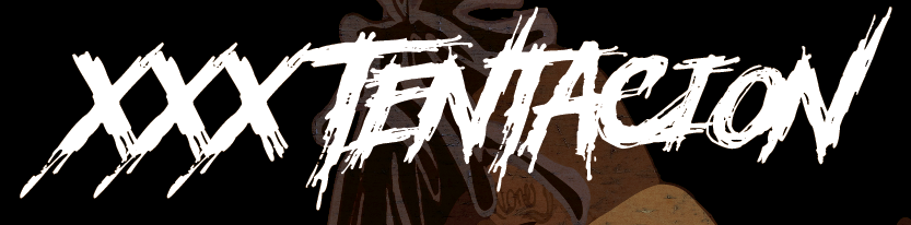
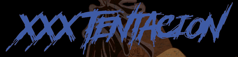
Now for the experimentation on how i decided to come up with the designs, for the text it was a simple decision because i wanted to use the text from his "Bad" song and below you can see the text that i used and the text that he used.

---His Text
My Text---

As you can see they aren't the same but they are similar and thats what i wanted to go for i wanted to keep the similarities in the designs the exact same now i have experimented with colours and all together i decided white would be the best for the designs.
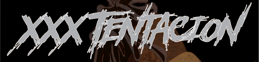
Now here you can see that the white fits the design and i like how it fits the designs because its a simple colour to be used for text and here you can see how effective it can truly be.
Image Experimentation

I thought of the idea of having a portrait of him added into the design and after seeing the design with it i thought that i would like it but looking back at it now i don't like it and there are many reasons for this and they are that the image on the cover doesn't look like its meant to be there and it looks like an original image and the only way i could get this photo onto the design was to image trace it and even after all of that i still didn't like the output and as you can see by the final designs i stuck with what i thought looked good and left it there.
And its exactly the same for this design below and the reason i didn't keep this design was because i didn't feel like it was up to the standards of what i needed.

For this design you can see the background is fitting to what the album cover says "Sauce"
however, i didn't like it so i kept with the original design.
Now for the textures i decided to have a look at 1 other texture for this design and below you can see the texture that i used.
Below you can see the texture that i tested with one of my designs.
The texture you can see is a marble however i didn't like the marble effect that it gave on the design so i kept with the original texture.

(Every texture i use uses this for the transparency)
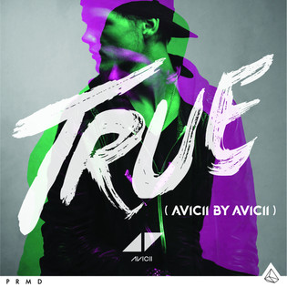
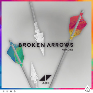
Avicii
So for this artist i decided to do some of his most known albums/songs below you can see some of his album covers and i wanted to recreate some of them so the songs i want to do are some that are old and one is 5 months old.
Songs/Album
So here you can see the song ideas that i had below is some image ideas that i wanted to look at, all of these are aviciis album covers and some are concept designs from people doing fan album art.


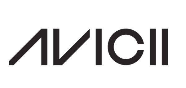
His Logo

His Text
Here you can see i have some sketches below this to give a basic idea of that i'm going to do, I have the idea of doing a split work which would link in with all 3 pieces of the album cover and i wanted to do the middle album cover in colour and black and white but having half of it split so one sides colour and one sides black and white, with this idea i will have one album cover in black and white while i have another in colour and the middle will be split between them.
The Work


Now you can see the designs in full you can see where i was going with the designs and they came out how i planned and i like the black and white one more just because i spent more time on that and you can tell that i spent less time on the designs with colour because the colours don't seem to fit and its not what i expected with the designs, However the designs are what i planned and what i was looking for when i finished the design, one thing that i would change if i was to do it again would be the colours of the coloured ones because i should of spent more time with the thought process but i was too eager to get into the designing process digitally i rushed the work and just went straight in to the work without considering colours and how its going to turn out and i didn't even think of that until i started designing them and thinking of the colours on the spot which i think was a big mistake on the designing side but i'm happy with the designs and how they are.
The Work In Full


So for this image you can see here this was the image that i took the most time on and below you can see what i experimented with to keep the designs looking the same

Here you can see the album cover without avicii and this is how i was going to do it inside my head but then i thought about adding the artist into the work and i also thought about adding avicii's logo in a full white as it was hard to see and if it was printed on a album cover so below you can see that i did
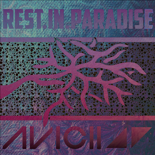
below you can see finished album cover for Avicii
Now here you can see Avicii in the background of the design work and i thought this created a better album cover for Avicii, The photo of Avicii makes the album more his because he's on it and i know he has his name on it but the personalised cover for him makes it a special album cover for Avicii and as you can see it does look a lot better than the other one without him in the background you can also see that i filled in the outline with his logo and this made the design look better than the one with outlines.
below you will see some experimentation i had with all of my designs.
Experimentation

Here you can see the logo that i have added in a outline and this makes the design look nice but i decided to do this because i got the idea from one of his album covers because the text was outlined so i decided to have a look and see what it would look like on my design and it doesn't fit a lot so i filled it in to a solid while.
Below you can see the few images i got the inspiration from


(Click the arrow to see the other image)

So here you can see my experimentation with the background and you can see that the white background doesn't fit as much as the other final image so you can see why i left this design.
Here you can see a comparison between my final image and this image.
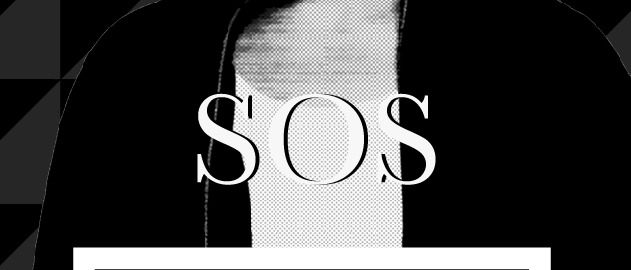
So here you can see my text experimentation with the "SOS" text and i didn't like the fonts that people where supplying so i gave it the real look and drew it out
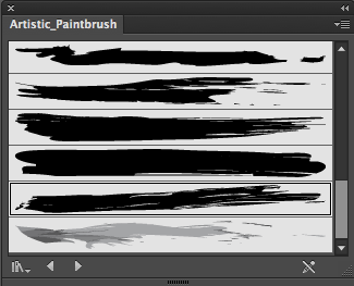
Here is the brush that i used when i did my new text and there was 1 issue with the brush and it was that i was too texturised so i found a better one and thats the one you can see on the left
(Below is the brushed text)

And here you can see the final text that i went with and this ultimately decided the type that i wanted to use in other Avicii covers.

So here you can see the image that i decided to do with a big white outline on the outside instead of it being black and as you can see it does make the design look nice but i decided to go with how i wanted it to look and not how i felt it should look and as you can see in the final image below i decided to make that the final image
(Final image below)
While i was writing this up i decided to create a tribute album cover for all of his songs to celebrate what he made before he died and you can see the design that i drew out and below that you can see the final image that i decided to go with because i had one way that i wanted it to be done so i didn't experiment with anything apart from the colours and it was just changing it from white to gold but ill still include that anyway.
Now a little easter egg for the poster design was including his logo in the background and you can notice the light and dark triangles and you can see that they represent his logo and i thought i was a nice little look for the images background and a nice easter egg in the art work that was designed for a tribute cover.

Here is the drawn out picture with how i wanted it to look like and as you can see you will notice one difference apart from the text and the thing you will notice more would be the logo because i decided that it looked a lot better with the outline turned off and the fill with the colour on this not only improved the look of it it made it look to the standards that i'm used to working with when i'm designing a new cover or poster.

The white image without the background added.
(Full gold design below)

So this is the last and final image for the Avicii Collection that i decided to do below.

This is the final image and what i decided to do was add an overlay to the work and below you can see the texture that i used.

Here are some other textures that i used on the work and as you can see this is why i chose this overlay and not these.


here is the texture experimentation that i did with this album cover and now you can see why i chose that i have because the image i have it looks so much better than the experimentation i had with all the other textures.
So with this below you can see what settings i used to get the final image the way it is.

This is what i used to make the image the way it looks.
Avicii - The Root Of Life

Here you can see i have a drawn out cover for avicii and i made up a song for it and as you can see this is how it came out.
Juice Wrld
So for the Juice Wrld album covers i wanted to show a bit of his taste in the designs so that means designing it like him and how he would do his covers so what i did is i did some research on his album covers and below is what i found and i thought would be a good idea to change up and re-design.


You can now see the work that Juice Wrld has for his album covers and what i want to do is create something in his way of designs so you can see the bottom right thats grainy that would be simple to do all you would have to do is draw it out invert the colours and add a grain texture to the work to really make the design come out how you want it too.
So the songs/ albums i want to do are listed below and they are 3 that i have listened to and i felt like something could be designed from it.
Here are the album covers of the songs listed above


So for my first cover on Juice Wrld i want to do the Goodbye and Good Riddance and i want to create it to the similar aspect to how he's done it but i want to add my own twist to the design so that would be adding the designs but in a sharper look.
Ideas for the "Goodbye and Good Riddance" album
Have a text that looks simple
Have a background that features a big moon
Make it in my style
have it hand drawn
These are some of the ideas that i will be using for the design of this album cover and below you can see some of the design process that i had with the final image.

Now you can see the image that was drawn and you can see some of the ideas that i was going for and ill talk in depth on why i picked things for this designs but above you can see the full design and what ill do is ill screenshot parts to talk about it.
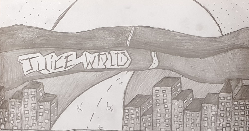
So this part of the design is supposed to symbolise the distance he's putting away from the girl he's talking about in the song and i also chose to do this because its showing the part of the title "goodbye" and its showing that he's moving away from the "big" city.
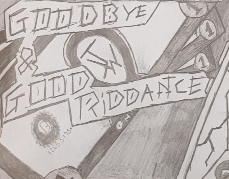
Here you can see the custom currency for his cover and i wanted to make it look like he's leaving everything behind with only $3 in his pocket and that he's going to build a new life with only that.
I decided to create a custom currency because if this was ever used in a mass distribution it would be classed as copyrighted.

Now with this i decided to show a broken phone just like his original album cover so i thought it would symbolise the damage that cant be fixed quickly and in the back you can also see a "king" and "queen" of hearts and the "queen" is covered up because she is no longer in the picture and you can see the "king" to where its covered up because he's scared to get "hurt" again and i'm also showing the "king" on his own because he's on his own from now on after saying goodbye.
For this cover i wanted it to be a drawn idea because i've found that drawing it shows what i want and its also what he had for his cover he had a drawn cover with colour and with mine its drawn in a grey scale.
I decided to do this in a grey scale to challenge myself since i've never really worked in grey and i wanted to see how it would turn out and for this being my first peace since i last worked like this in high school i feel like it came out better than expected and as you can see by the finished product it looks a lot better because i took the time to plan out what i wanted in the album cover and what i did was listen to all of the songs in the album and below you can see the songs listed below with links to the music.
GOODBYE & GOOD RIDDANCE ALBUM:
This is the album from Juice WRLD and what ill do is ill add both of the album covers below and you can have a look for yourself and see if you think the new one is better than the old one and if you do feel like the original is better thats ok i decided to remake this album because i've listened to it a couple time before and i thought the art work on the original cover looked a bit bland so i wanted to re make it.
My Design
Juice WRLD's Design
One thing i would like to add is that his album cover is in colour and mine is in black and white and as you can see them side by side they obviously look a lot more different from each other.
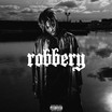
ALL GIRLS ARE THE SAME
The next cover i want to do is Juice WRLD - All Girls Are The Same and with this its just going to be a digital design below you can see my drawing that ill be basing this design on.

Here is the drawn album cover for the song Juice WRLD - All Girls Are The Same and the song talks about drug using so as you can see i have included images of drugs on the cover.
Juice WRLD says in the song about a grave so i've also included a coffin on the top labeled "999" since thats Juice WRLD's logo so i wanted something on the cover that people would recognise.
I've also added buildings and the buildings you can see i have taken inspiration from the music video buildings that Juice WRLD is lying on.
Stuff i want to include in the design that i am going to do: in the form of drugs
Make different changes to make it look similar to the original artwork.
Include similar objects in the design.
show a presence of evil
Below you can see my design process while i'm designing the song cover.

Here you can see the finished design for Juice WRLD's All Girls Are The Same song and below you can see screenshots of the design showing why i did these parts the way i did and it will include a bit behind why i chose the specific things.

Now with part that you're looking at is the title of the song i wanted it to look like it was someone sending a text message and below that you can see "999" which is Juice WRLD's logo as you can see below.
I also wanted the title look like someone is replying so Juice WRLD so you can see the bubble that comes up as if someones replying to his message


So with this screenshot you can see hearts and drugs and i wanted to add a bit of a mix into my design so you can see the broken hearts and the full hearts this is showing that she broke his heart after doing something bad and the full hearts represent the love he still has for her the drugs in the background represent that she's and addiction and we know its about a girl because of the song title "All Girls Are The Same" this is showing that he cant live without her too because people take drugs to either pass the time because they are bored or because they are depressed.

With this screenshot you can see the white dots in the background and i wanted this to represent the idea of getting high in your head so when he takes the drugs in his head thats what he sees this idea came to me when i was at home researching Juice WRLD and his use of drugs so i wanted to add that onto his cover.

With the text i had the idea of making it look like it's falling apart and its an accurate representation of what he's feeling like you can also see the rough indentation of buildings in the text i wanted it to look like that so it looked like he was leaving the big city because of what the girl did now it isn't clear on what she did in the song but we know hat she broke his hear so i wanted that to appear on the text.
So something i learned while making this cover was that if i added an texture and it looked a bit rubbish i could change the opacity of the layer that the texture is on and i would see how it looked from there and as you can see my final design looks better than i expected.
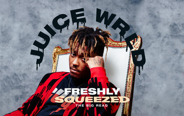
Juice WRLD Legend's
So for the legends cover i wanted to make it like its a remembrance cover to xxxtentacion and lil peep and as you can see below i decided to draw out the album cover and leave the people out of it so i could see what to do with the design when its done and even in the photo you can see that i wasn't too sure where to put Juice WRLD and in the final design we will see where i decided to put it.

For the design you can see what i want to do with it and you can also see that the people haven't been included because i wanted to plan that later to work the design around them now my idea for the text would be one that i was using last year and this is the "american captain" and the reason why i want this text is because it makes the design look clean and well planned so this is the text i want to use in the final design because i feel that it will make the design look 1,000 times better.
Text Below

This is the "American Captain" text

As you can see i did the design digitally and one thing that i would change with this would be the position of the text because it doesn't look as nice as i want so i did dome experimentation and i've found that the text looks better in the screenshot below.

This looks cleaner and nicer.

Here you can now see the people that i have added onto the design so what i wanted was the two dead singers in the background as if they are still living with us i also wanted to see Juice WRLD above them because he's still alive and this is his song so i wanted to make it look like he's popping up out of the legends part of the design and as you can see it looks a bit plain because i was going to leave it there and i had a thought of using a texture that i had seen on the internet and below you can see what i have done with it.

So this is the final design for his "Legends" cover and if you want to see what i used for the opacity and the mode that i used it is below.

for the texture i decided to use the Darken mode with an 80% opacity and this made the design look exactly the way i wanted and i think that it came out amazing using this.
Collaboration
For the collaboration with another student who had a "Radio Station" what we would do is we would get a logo and a design that you had made and you wanted it to "Feature" on the station you would put the sticker on the work to show its a collaboration piece of work
Here you can see the Avicii work that i did and in the bottom right you can see the logo for the "Radio Station" now that logo that you're seeing is an old logo when we where thinking about doing this collaboration now this is the only piece of work that has the logo on currently but there is a full sticker design that includes a logo that i can place on my work and with whatever piece i wanted to include it on
All Of My Designed Work That I Showed At The Start
Evaluation/ Reflection
For this year i have improved a lot with my graphic design skills in illustrator and as well in photoshop in the last project i did i didn't use a lot of textures and often felt that i was going behind on my work and now that i have this project to compare to the last one that i did i can now say that i wasn't prepared for my last project at all because i had horrible time management so for this project i focused on doing my work and 1 day out of every week i. would update this blog with all of the work i had done over that week .
This project that i'm working on has pushed me out of the comfort zone of just designing on illustrator all day and i didn't like that i did that all the time because i found myself over working digital designs so what i wanted to do was get some hand drawn work into it and last project and as well as last year i didn't find myself doing that at all so i wanted to get some of my work hand drawn now with my hand drawn work i did one in a full sketch with just grey scale to work off with the colours and for my other one i drew it out and planned it as if i was on illustrator and i used water colour .
Last year i hardly used textures and it was silly of me not to because i've found out this year that textures improve your work a whole lot more and i didn't realise this the first couple of times so i wanted to push myself more to use a lot more textures and it shows that a simple texture can make your work look a lot more professional. I found that using textures was harder than i expected because most of the time it was hard to find a texture that didn't mess up the designs with the settings that i used and as you can see with all of my recent work these textures made my work look so much better than i had thought but it did take me a while to get a whole bank of texture to get my work to the standards of last year, however this has given me a massive push to try new things because you might never know how well a design might of come out if i was using them designs.
In addition to me going out of my comfort zone with my designs i've learned to work faster and better cutting my designing time to almost half i've also learned to work more independently this year with this project its shown how much i can really get done if i work a lot more independently.
With my FMP last year i did a collaboration with another student and what we did was have our designs together so this year with this project i decided to do it again and this ment that the other student created a radio station with its own logo and for the work it would feature his logo on my cover and its like a new record sig ing an artist to cover his music we did it to show that no matter how different your deigns may be it will fit together now with this i decided to use one of my drawn pieces of work to show it so on my Avicii drawn cover it had the tag "Space Jam.FM".
Lastly i've improved massively with my design work in general because i've taken the time to think out my designs and i've spent more time this year and on this project just planning my work in general and you can see because you can even see the improvement from last year.
What Primary Research Did I Do?
For primary research i did little to none and the main reason for that is because i was mostly busy with work inside and outside of college so it became difficult to go out to find music covers.
What Secondary Research Did I Do?
For secondary research i did loads and this is including searching past album covers for all of the artists that i was doing for my project and i came across so many different types of styles and it fascinated me so i looked around and even below you can see all of the covers that i looked at for this project.


so from this i created all of my work for this project and it gave me a lot of inspiration for a lot of other things too.
How Did My Research Help Me To Develop Ideas?
So for my research it helped me massively with developing my ideas for my designs because i used some of the designs in helping me with ideas so with other cover i took their designs and added it to another cover so when i did this it made me change my ideas on what i wanted for other covers so it massively impacted my final outcomes for my artwork.
How Did My Research Inform My Final Outcomes?
My research inform my final designs by shaping my ideas to produce different outcomes for my work and this shows in my final designs that i have created.
What Artists/Designers Have I Looked At?
so for this i really didn't look at any designers who created album covers so all of my inspiration came from looking at past album covers and giving my own style and my own look to all of the work that was produced so in future that is something i want to look at some more because i did little to non with this project an it became a massive issue when i ran out of ideas for covers so in future ill make sure i get a much more brooder spectrum of designers and artists to look at with the work i want ideas for.
What Were My Initial Ideas?
So for my main ideas i wanted my own take on the art so its something close to me when i was designing this work however when i was i wanted to change it so it would become something much more than my own ideas i wanted it to become an inspiration for another designer who's looking to design album covers.
How Have I Developed Those Ideas?
With this i have developed my ideas by testing out alternative colours for my designs and this not only improved what i was looking for in my designs it gave me the process on what to do next and what to pick in the first phase of designing it when i'm planning out stuff.
What Materials And Techniques Have I Used?
For this project i have used a lot of texture and with that its made me spot the perfect texture for artwork that i am currently working on so its made me have a very good eye for the designs and the textures that are being used.
Which Materials/Techniques Where Most Successful?
Definitely the most successful idea i have used is without a doubt the textures because it has impacted my work a lot more than my designs before i even added any textures on my work but yeah i'd say the textures have been the most successful technique i have used for this project.
What Did I Learn From This Project?
So for this project i have learned a lot and by a lot i mean a lot because i really didn't know how to used textures effectively in illustrator before this project and this came as a bit of a shock to me when i didn't figure out textures sooner but its made my work a lot more better than my FMP last year so one massive thing that i have learned from this project is the use of textures in a design.
Another thing i have learned from this project is to push yourself out of your comfort zone a lot more because when i did i made one of my best designs yet and thats the Juice WRLD cover for the "all girls are the same" song because when i was designing this i didn't even include the amount of stuff i've done now so thats another thing that i have learned from this project.
Have I Been Successful In My Final Outcome?
I personally think that i have become successful with my outcomes, all of my designs have come out exactly how i wanted it or even better than how i expected it to look.


Comments