FMP - The War Effort
- Nathan Jackson
- Feb 10, 2020
- 5 min read
Updated: Mar 3, 2020
Summary - For my FMP i'm going to do war time posters with some clothing designs my idea of this came from my last years FMP because i did the current aircraft thats in the military and made a poster on the the place where jets go low level training in the mach loop so with this i wanted to do a flash back in time with all the old planes that had a role in WWII with this i wanted to create a side by side view from the allied side and the enemy side and the idea i would have is i would create 8 posters in total 4 for the nazi side and 4 for the allied side now with these posters there wont be any facts on them there will be just recruitment posters for each of the sides i didn't want to create something i didn't like doing.
For my research i've decided to look at some past poster of the was and below you can see what i was looking i wanted to make sure that these posters captured everything that i thought about doing in my designs and i think that the posters will match the research because of the way i want to design the aircraft on the allied side and on the nazi side.
Some of the posters that i've found:


one thing that i like from this poster is that it has the lines in the background and i feel like this is really effective for creating a different background that no one really sees now this poster here looks like its Russian and i say that it looks Russian because of the colours that are used in the design. Now with the idea id like to take from the design is the lines because i find them really fitting for a new poster background and it would be my first attempt at designing a poster with this background so i feel like it would give me a lot of new ways to experiment with the backgrounds when it comes to designing the outcomes this would make it easier to reflect on my work.

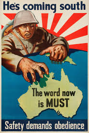
With this poster i really like how the design is made and with how its created and what i could possibly use from the design. From the design i would want to use the aircraft thats being shown here and by that i mean show an air to air combat showing that british people need help in the war effort. In the poster i like the background because it shows that they will fight any time of day and weather and this shows that the germans where a real imminent threat also another thing that i like from this design is the place where the title is and its the simple things that make a design look so much better because you can see "Back Them Up!"in a simple colour that represents the "RAF" and i think that this is a simple but effective link towards the poster and who its promoting.

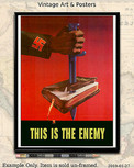
This poster shows a soviet style and its shown with the red and black colour scheme but by this it looks like its either a british or american recruitment poster because you can see the english that is written on the design. One of the things that i like on the design is the use of the black making the hand merge into the title also i like how you can see the red and how it looks like its the shadow of the tool thats used to tighten the wheels and we know this because of the title at the top of the design " Keep The Wheels Turning!" so i'm making the assumption that this is for wheels because you wouldn't put it in a design if it wasn't related to it overall i like the design because of how simple and effective is can be.
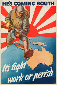
While i was looking for things to research on this topic of recruitment posters i saw a variety of different countries posters on how they recruited the public into fighting the war i saw the soviet and the german posters however when i looked at them i could see that the posters itself where simple and effective with their target audience.
The Books


Now with these two books its given me a proper understanding on what to do when i'm designing the posters
My First Poster
For my first poster i wanted to do something that wouldn't be something that i'm used to so i wanted to do the german poster first and with this poster i wanted to create a dirty old look for the poster because the country is meant to be at war and all their people are poor and it would more than likely be run down and look like its been there for along time.
For the poster i didn't know where to start so i decided to start looking at past Nazi recruitment posters so it would help with my ideas on what i was going to do. When i was looking at the past posters that you can see below it gave me an idea on what to do now with the poster below it really caught my eye because of the flag placement

Now i know this isn't germanys poster but when i was searching "WWII Recruitment Posters" this was one of the posters that i found now most of the posters where German and British but this one really caught my eye mostly because of the flag in the background and i wanted to do something like this.
Things id have to do with this poster would be making sure that the placement was different and i'd have to add a texture to make the poster look like its worn down and fading this would really bring the WWII look alive because it would be old and worn down.
For the text i would want something like "Stop The British, Join Us" but it would be translated into german.
Sketched Idea

As you can see here the sketch is simple but its how i wanted it to be laid out when it came to creating the poster because the background needed to be done like this and i did it like this because it looks like the flag is taking over the world and that Britain is next to be invaded and conquered i really wanted this to live through the design because the germans believed that they would take over the world so i wanted to show this.
For the starting part of the design i wanted to have it all drawn out to where i could easily fill it in with the paint bucket and add stuff over the top of the design.

As you can see here this is the first part to the design and with this i wanted to make sure all of the layouts where the same but make it much more cleaner and smoother and below this you can see what this looks like with the colours filled in.

with this as you can see the colours have to be dark just to make the white pop out of the design.
The thing that inspired me to do the poster this way was a design for another country and i wanted to see how it would come out of it and below you can see the 2 posters that inspired this look with the flag in the background.


Now you can see where i got the looks and feels for from the design and i needed to keep my design in my was but make it look old with a texture my initial thought was to make the poster without any texture but by then i thought it wasn't going to happen because i really liked my designs with textures and i was curious to se what the final outcome would look like if i was to put a texture over it.


Comments