Will Draw For Food Project
- Nathan Jackson
- Sep 9, 2019
- 8 min read
Updated: Sep 20, 2019
WILL DRAW FOR FOOD
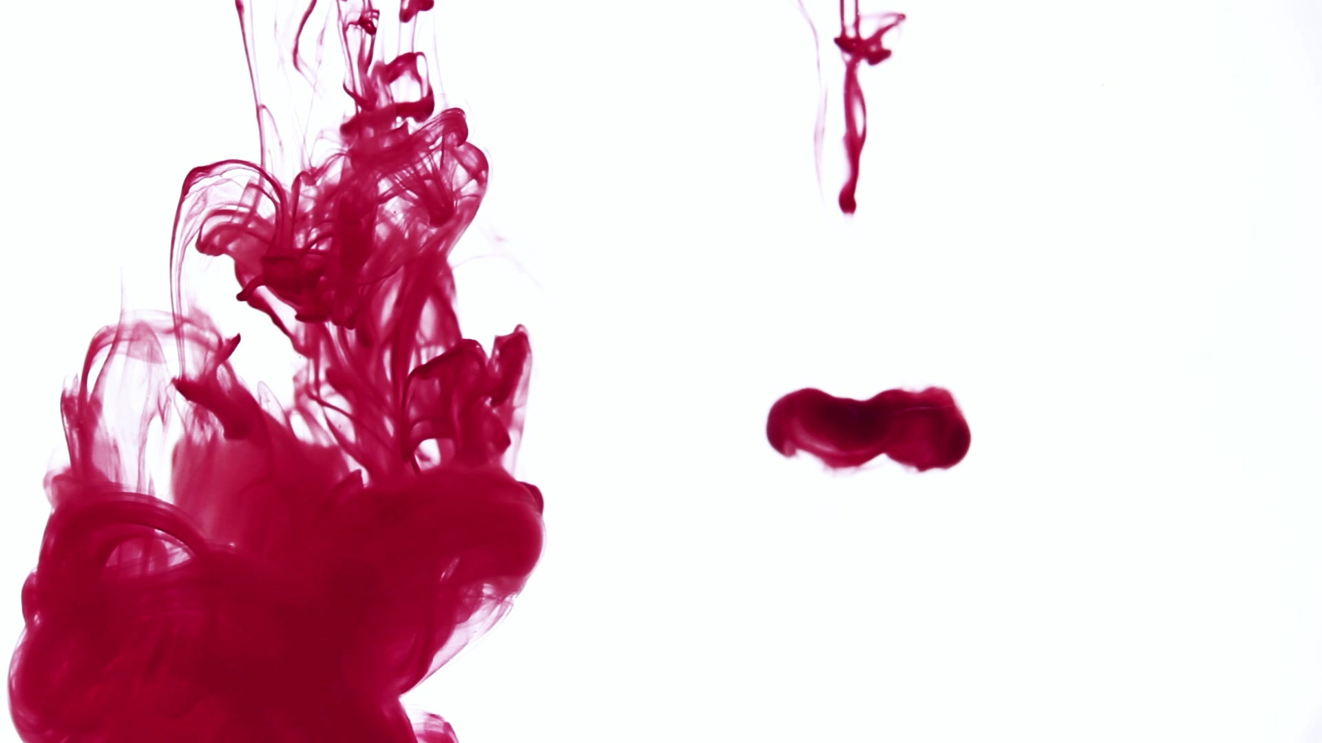
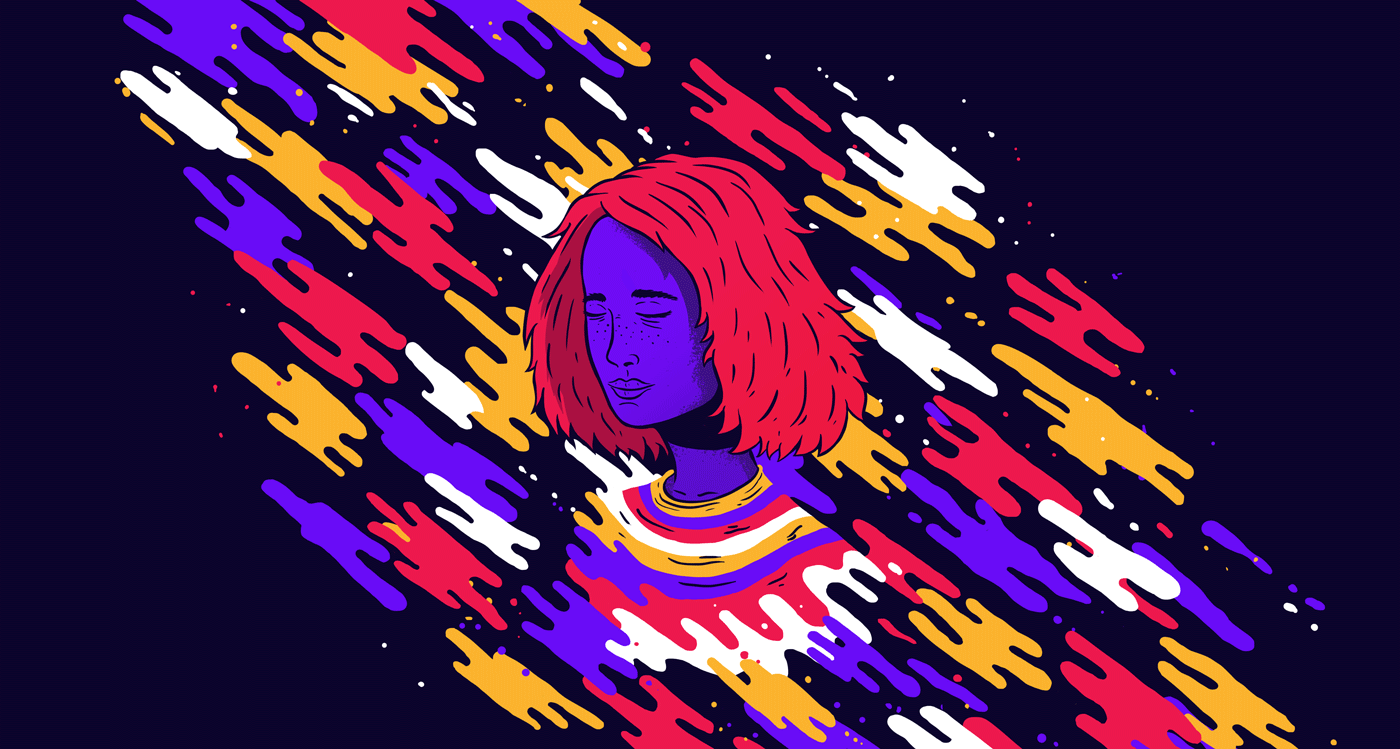
so today we have started doing artist research on artists that draw food and other consumable products, here you can see the artist Lucas Wakamatsu and here you can see some of his work that i have been looking at: https://www.behance.net/gallery/40485061/Resonance
Some Background information on Lucas Wakamatsu. Lucas Wakamatsu is a Brazilian illustrator and graphic designer based in São Paulo. He is currently working as a full-time freelancer.
His style is a modern mix of simple shapes and eye-catching colours that make the image really stand out this doesn't only make the work stand out it makes the image look professional and well thought out and as you can see below the expectations truly hold up.

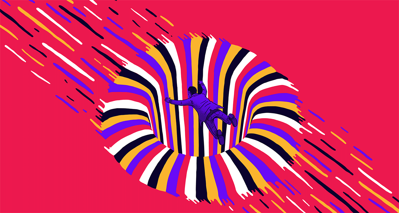
So here is Lucas Wakamatsu's project called "Resonance" and as you can see by the following images that his work is really amazing with what he can do as an animator as well as a graphic designer.


<--- Flick Through --->
3 Things I Like And Dislike About The Art
Like:
The vibrant colours in the work make the image come alive
The use of animation to show of his work
Simple designs that look amazing
Dislike:
The use of outlines on the illustration of the characters
The use of some of the shapes in his work
How he's used some colours in some places
Planning The Work
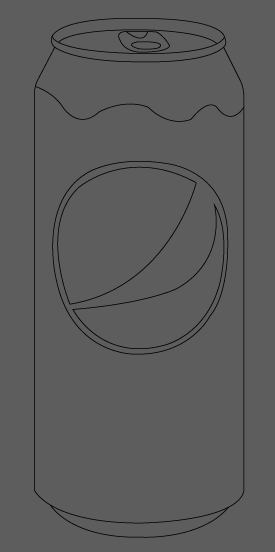
When i was designing the sketches you can see i had a couple of ideas and with my first idea i had the idea of making the can look like its been drawn by a child but at the end of designing all of my ideas i thought maybe the idea of number 1 wouldn't be as good as i thought so i decided to go for idea 3 and as you can see i have developed the idea with designing the strip.


Can Design
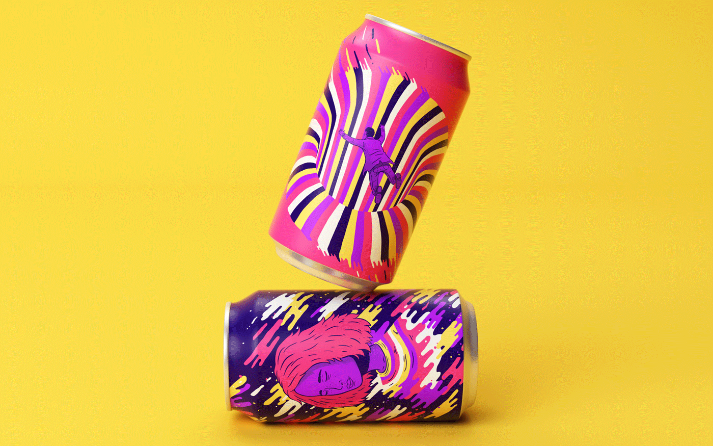
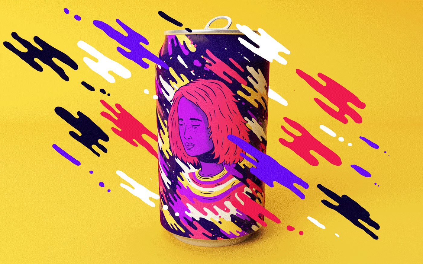
In Lucas Wakamatsu's project he put his designs on cans and thats the only link i have with this project and Lucas Wakamatsu's project however i would like to animate some of my designs like Lucas Wakamatsu.
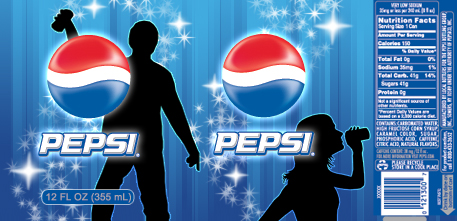
For this project i decided to use "PEPSI" as my base lay out for my designs i chose Pepsi for the simple design of the can and i wanted to re design it to make the can not only look better but to have my own impact on the design with some of the work i have done previously and here you can see how i've set up the design and how i've followed the process thought it.
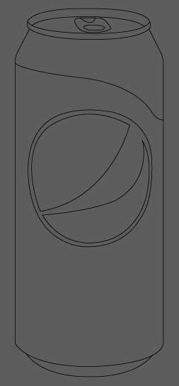
So here you can see the can lay out and design i first started off by drawing the outline to the can and the Pepsi logo, the only troubles i had with drawing it out was the tab at the top of the can as i didn't know how to make the image look 3D instead of flat now you can see the part at the top of the can that looks like a cover and thats exactly what it is this would be use to show the public what the flavour of the drink is, I've experimented with ideas on how to come across this and show what the flavour is without typing it on the can so i had the idea of using that of a concept design that i saw at the time of making the image and as you can see below you can see the different ideas i had on showing the flavour with a small banner on the can.

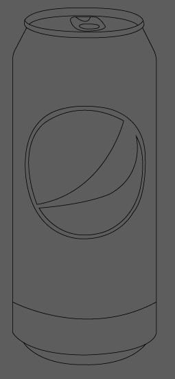

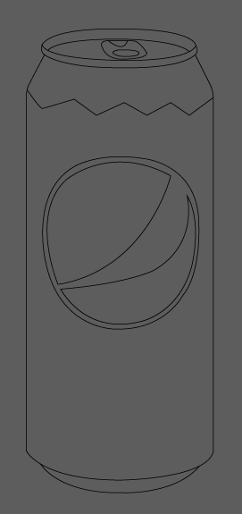


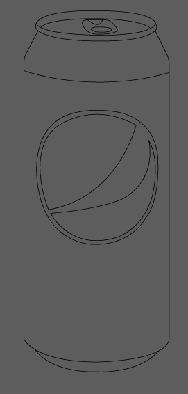

Now with the layout of the can thought about i decided to have my own look on the design and with this i decided to add a simple look but a look that stood out to the eye of the buyers now when i thought of it and when i drew it up in my book i didn't like the design or the idea around it but i decided that i would add it to a design and if it looked bad i could use it as a reflection piece and show what i didn't like about it and what i would do differently in my next project but i decided that i would keep on trying the design to see what the outcome would be like and with the design instead of making it a flat design i wanted to make it look 3D with a part of the image that would be a matte flat colour if it was printed onto a can to make it have a bit of roughness to it.

As you can see here i decided to make the colour in the sky on the right light because i wanted to test out to see if the colour would be good enough for a 3D effect and i thought to myself that i wouldn't need to change the original Pepsi can colour i would only need to change the design of the can and the lay out of the can and as you can see on the left i changed the colour to a darker blue and i changed it to this blue because when you create a gradient to make it look 3D you need to have white in it so it looks like its shining of something so you lose a bit of colour so you have to compensate with this and i found that by testing ideas.

Here you can see i've added the gradients to the colour on the background, label, logo and rims of the can and i left the mountain in the background to stay as a flat image because my idea around this would be that it would add grip to the can when your drinking it so it doesn't fall out of the consumers hand. While i was looking at this i thought the cans design looked a bit boring and plain so i decided to go back to the drawing board and think out some changes to the design, I had the idea of adding the bottom strip to the can to be red to not only show the person who's using the can but for it to hold the text of the flavour but with that i would also be adding the image of the item that its meant to be flavoured like to the to the logo.
-----------------------

-----------------------
----------------------

Here you can see what the design looks like with the strip at the bottom of the can and when i added this it made the design look so much better in my opinion it made the design pop with the perfect amount of colour and i added the gradient to it to make it shine too.
I decided to add a couple of flavours to the design to make a poster for "new flavours" that would be added to the Pepsi range. ( you can see them below )

The one on the far right of the design was meant to be Blueberry but i forgot to change the text before i took a screenshot of the work.

Here was the original design that i had and i got feedback on my design and i got told that the 2 green cans looked to similar and that they needed to be moved so i swapped over he ginger can with the mint so the colours didn't clash too much also as you can see there are some flavours that are in this poster that are in 2019 but i made this poster to have a retro look to their old design so back towards the 1990's and this would be a reveal that would bring these new flavours out.
Here in the design you can see that i've added the new logo thats on their cans currently i wanted to create a retro design that has some of the current properties that we see today.

As you can see i have created a background for my poster and this has made the poster come to life i have also used the old text that pepsi used before they witched to their new text and logo. This poster was used for a retro look on poster design and this created a big impact on the look and final outcome to the design.
Packaging Design
For this part of the project i wanted to create a flat image to what the design would look like on a flat surface without being wrapped around a can so as you can see below i have done some research on the pepsi packaging look i wanted to keep the idea around the design the same without changing too much.


Here you can see some of the packaging that i have chosen to take inspiration on but like i stated i wanted to keep my designs with minimal changes to the original way thats shown in the poster.
You can see with the packaging on the left some of the designs show 2 pepsi logos and this would be for the used to be wrapped around a bottle, however some of the designs show only one logo that can be seen and i think this would be used for the smaller bottles.
Things i like about the designs are that they are very similar to each other because 2 of the designs use ciliates with the same shading on the logo with the white highlights and since i'm looking at retro styles the text is also the same for every single design.
Why Did I Chose Pepsi Over Coke?
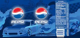
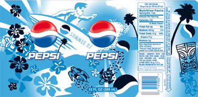
I chose Pepsi over Coke for the simplicity of the Pepsi can because all you need for the Pepsi design is the logo, text and the colour blue and as you can see in the images below i decided to show a comparison between Pepsi and Coke.
I also chose the Pepsi can over Coke can because as you can see how the design of the can is different and the coke can look's harder to wrap around the design, I decided to go for Pepsi not only because it's simple but because it's an easy alternative to add the design around the can so i stuck with that choice.
However, before i chose Pepsi and Coke i had thought of using the Sprite can as a perfect idea to use for the design work as i could change all of the can but just leave the colours and text and completely re-work the design and i struggled with trying to re design it in my head because before i design anything i think of how i would do it in my head before i even go to planning the work and i thought to myself it would be hard to do and i left it so i went to look at the Coke can and Pepsi can and i saw that they where more popular cans and i thought the Pepsi can looked easier so i stuck with Pepsi.

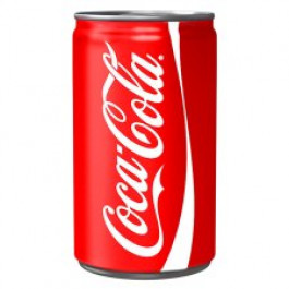

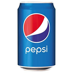
So here you can see the comparison between the two and the pepsi can stands out because its a bright blue with the logo and the text saying "pepsi" and as you can see on the left of the Pepsi can is the Coke can and i didn't chose this because i didn't like the design i also thought the Pepsi can was a classic can to design because of all the old retro looks i wanted to go for.

So here you can see the full layout on how the can would be designed and this shows people what the can looks like flat i have also added the nutritional factors into the can design so its not a flat image and it could legally be sold to the public but this is a concept design so this design wont be distributed.
with this design i felt that i had to show what areas would be shiny and what areas would be matte so i added a gradient to show the metallic look of the can and as you can see its came out great and exactly what i was looking for.
Links I Have Used:
The links i have used for this project are listed below


Comments